Quick Summary
Use a Pantone reference or physical swatch as the target for a brand-critical hijab colour, and use a screen image only as a visual explanation of the wider design. A colour brief should identify the base fabric, finished size, print or solid direction, priority colours, reference source, and approval question. The physical sample remains the point at which the designer reviews the colour on fabric rather than assuming a monitor preview is an exact match.
A screen colour is useful for showing the mood of a hijab collection, but it is not a complete colour brief. Monitors differ in brightness and settings, and a fabric surface is viewed by reflected light rather than by the light emitted from a screen. If a brand-critical shade is described only as "soft olive" or sent as a screenshot, the design team has to guess which part of the colour matters most.
For a custom hijab project, the clearer approach is to separate three things: the screen or digital artwork that explains the design, the Pantone reference or physical swatch that identifies a target colour, and the fabric sample that shows how the target reads on the chosen base. This guide helps founders, designers and boutique buyers prepare that brief without treating a screen preview as proof of the finished colour.
What Each Colour Reference Is For
A screen preview communicates the overall composition. It can show how a border, motif, background and accent colour work together, and it is useful for checking whether the file being opened is the intended version. It is also useful when discussing a collection internally, because everyone can see the same artwork layout on the same page.
A Pantone reference gives the production conversation a named colour target instead of a descriptive word. For brand-critical colours, send the reference used by your team and identify the exact colour name or code in the brief. If your brand team works from a textile reference book, state that clearly rather than sending a code copied from a different colour system.
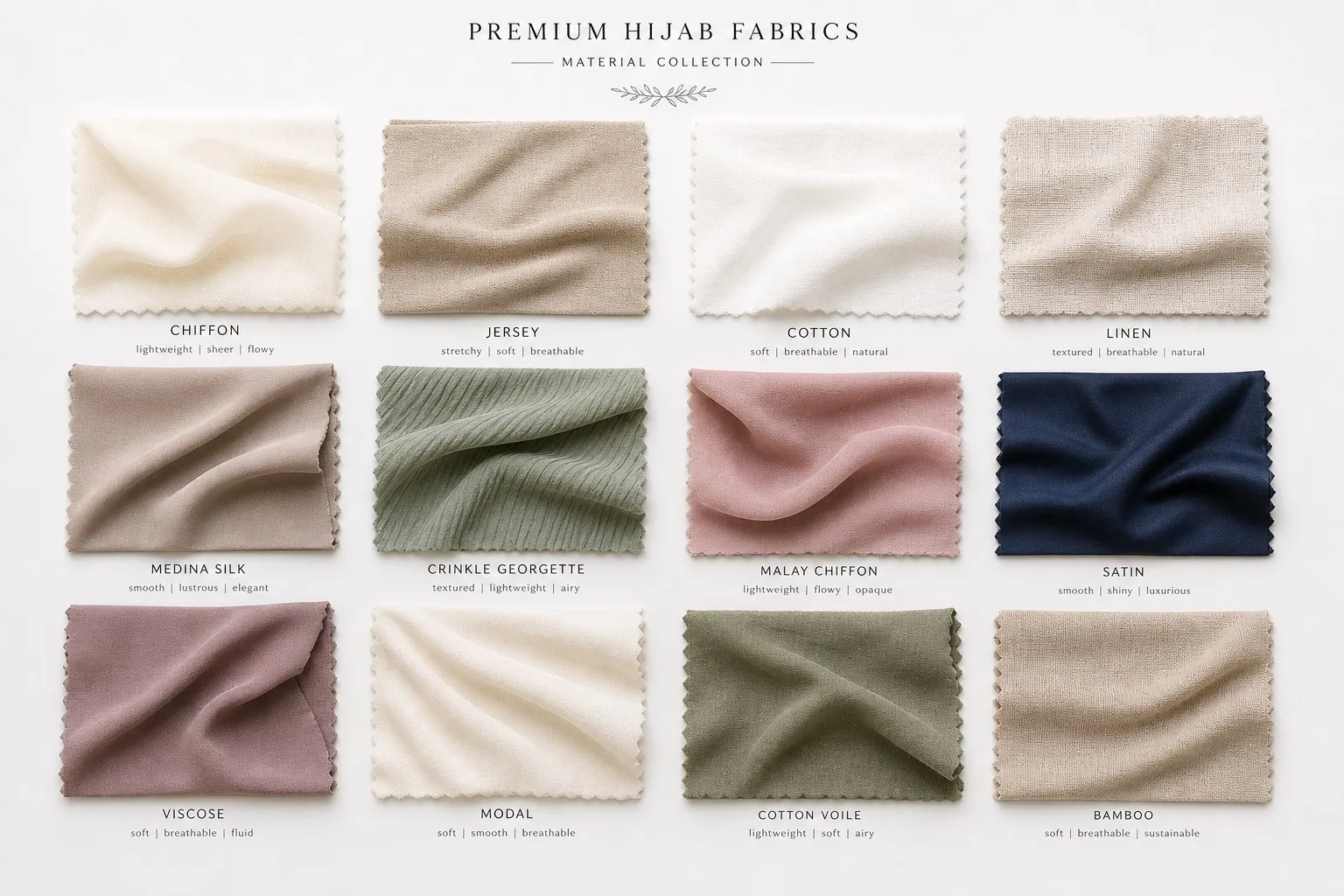
A physical swatch gives the receiving team something that can be held and compared under the same light as the fabric sample. It can be a textile swatch or another agreed physical reference, but the brief should say what it is and which part of it is the target. A small paper chip, a fabric cutting and a screen image are not interchangeable evidence.
Why Screen Colour Should Not Be the Only Target
Screens emit light, so a colour can appear brighter or more luminous than it does on cloth. Two devices can also show the same digital file differently. Brightness, display settings and surrounding colours change perception before the file reaches the sampling stage.
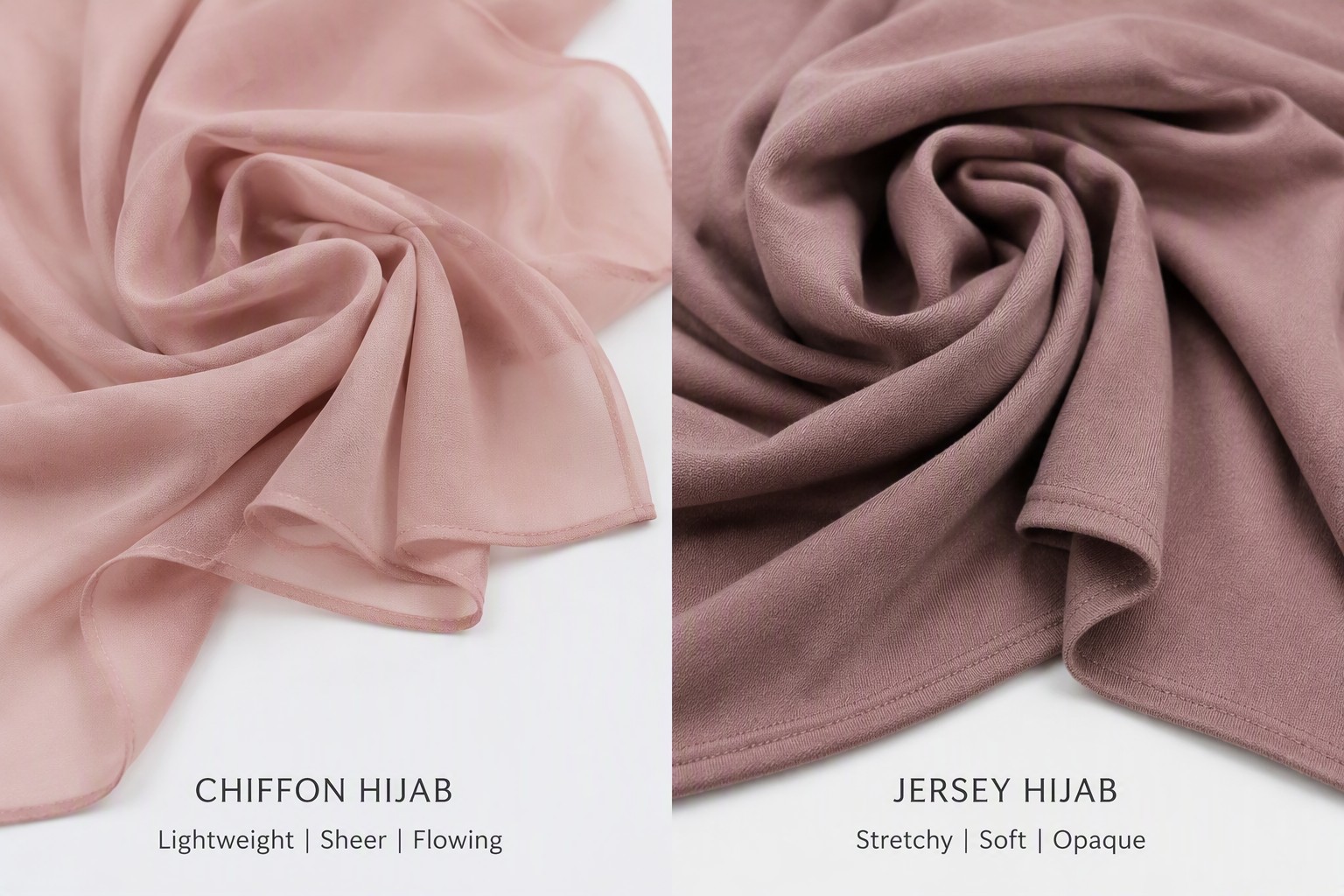
The fabric base adds another variable to the review. A custom printed modal style and a jersey modal style do not answer the same material question: modal identifies a fibre category, while jersey identifies a weft-knit structure. If the same artwork is planned for both, treat the colour review on each base as a separate design decision rather than assuming that one screen preview settles both.
This does not mean a screen mock-up is unnecessary. It means the mock-up has a different job. Use it to check layout, hierarchy and the relationship between colours. Use the Pantone reference, physical swatch and printed sample to discuss the target shade on the chosen fabric.
When to Send a Pantone Reference
Send a Pantone reference whenever a colour is part of the brand identity, must sit beside an existing product, or needs to be compared across several colourways. This includes a signature background, a recurring logo colour, a border that identifies the collection, or a solid shade intended to sit next to a custom print.
A reference is also helpful when the artwork contains several close neutrals. Words such as sand, stone, taupe and mushroom can describe different targets to different people. Naming the priority colour and attaching its reference tells the team where a closer visual match matters and where a small visual variation may be acceptable.
For a print with many colours, do not assume every pixel needs its own physical reference. Mark the colours that are non-negotiable and label the rest as supporting colours. This keeps the approval conversation focused. The priority list should be part of the file package, not a detail mentioned only in a message after the sample is made.
How to Build a Useful Colour Brief
Start with the design identity: name the collection, design, colourway and version. Then state whether the project is a custom printed modal hijab, a jersey modal hijab, or a Pantone-matched solid modal direction. A colour reference without the base fabric leaves an important part of the sample question unanswered.
Next, list the finished dimensions and the artwork direction. For a listed custom printed modal style, Yiling uses a 180 x 75 cm format; other styles can use different dimensions, so do not copy that canvas into a jersey development file without confirming the style. State whether the artwork is a placement composition, an all-over repeat or a solid colour brief, and attach the full-rectangle view.
For each priority colour, record the reference source, the reference code or name, and the role it plays. For example, identify the background, border, logo or accent rather than sending a list of codes with no explanation. If a physical swatch is being mailed, label it with the same design and colourway name used in the digital files.
Finish with the approval question. Ask whether the sample should be reviewed for the closest overall impression, a particular brand colour, the relationship between two colours, or the colour on a second base fabric. A sample review is more useful when the team knows which decision it is expected to answer.
Pantone Reference, Screen and Swatch: A Simple Handoff
Package the colour information in three layers. Layer one is the working artwork in an accepted file format, with the colour names or codes noted in a separate guide layer or brief. Layer two is a flattened preview that shows the complete hijab rectangle, not only a cropped social-media image. Layer three is the physical or named colour reference for the shades that matter most.
Yiling accepts AI, EPS, PDF, PSD and TIFF files for artwork. Send one clearly named file per design and colourway, and keep the version number consistent across the working file, preview and colour brief. If the file has guides, mock-up shadows or notes, label them clearly so they are not mistaken for artwork intended for printing.
If the colour reference is a physical swatch, photograph it only as an orientation aid. A photograph of a swatch is still affected by the camera, lighting and screen used to view it. The physical reference itself should remain the agreed source for the comparison, and the printed sample should be reviewed under consistent lighting.
How to Review the First Fabric Sample
Begin by checking identity and scope: is this the correct design, colourway, base fabric and version? Then compare the sample with the agreed reference under consistent lighting. Look first at the priority colours named in the brief, then at the relationship between the background, motifs and border. Do not let a small accent distract from a background shade that the brand has marked as non-negotiable.
Review the sample flat and in realistic folds. A colour may appear to change in a fold because less surface is visible and shadows affect perception. That is a styling observation, not by itself a laboratory result. Keep the review focused on whether the printed design gives the intended collection impression and whether the reference target is being met closely enough for approval.
If the sample needs adjustment, write feedback by colour role and location. Say which colour is being discussed, where it appears, what reference it was compared with, and whether the next version should be lighter, darker, warmer or cooler. Avoid replacing a precise note with a new screen screenshot and an undefined instruction such as "make it more premium."
When the same artwork is being developed on more than one base, review each sample separately and record the decision for each. The goal is not to force two fabrics to look identical on a monitor; it is to decide whether each finished sample supports the approved brand direction.
Common Colour-Brief Mistakes
The most common mistake is sending only a screenshot. Another is mixing colour systems without saying which one controls the approval. Copying a code from a website, using a paper reference for a textile decision without identifying it, or naming a colour only with a trend word can all create ambiguity.
It is also easy to send the right reference with the wrong file version. A colour brief named "final" can become unclear when the artwork is revised later. Use a design name, colourway name and version in every filename, and update the preview and reference notes together.
Finally, do not treat a digital mock-up, cover image or styled product photograph as colour evidence. These visuals are useful for communicating direction, but they are not a substitute for a named reference and a physical review of the printed sample.
A Colour Approval Checklist for Hijab Designers
Before sending the brief, confirm the base fabric and finished dimensions; state whether the project is a print or a Pantone-matched solid; identify placement or repeat when the artwork is printed; mark the brand-critical colours; provide a Pantone reference or physical swatch for those colours; include the full-rectangle screen preview; name the file version; label any physical swatch; and write the exact question the first sample should answer.
Before approving the sample, confirm that it is the correct design and colourway; compare it with the agreed reference under consistent lighting; review both the flat rectangle and realistic folds; record feedback by colour role and location; and keep separate decisions for separate base fabrics. If the sample is being reviewed for other properties, request the appropriate evidence rather than treating colour appearance as proof of fastness, shrinkage or sun protection.
When your colour brief is ready, send the design direction, base fabric, reference colours and sample questions through Yiling's contact flow. A clear handoff lets the first sample focus on the collection decision instead of asking the production team to interpret an unlabelled screen image.
Frequently Asked Questions
Is a screen colour enough for custom hijab printing?+
A screen preview is useful for showing the artwork and colour relationships, but it should not be the only target for a brand-critical colour. Provide a Pantone reference or physical swatch and review the printed sample on the chosen fabric.
What should I send for a brand-critical hijab colour?+
Send the working artwork, a full-rectangle preview, the named colour reference or physical swatch, the base fabric, the finished size and a note explaining where the colour appears and what must be approved.
Can I use the same colour reference for modal and jersey modal?+
You can use the same reference as the starting target, but review each base fabric separately. Modal identifies a fibre category and jersey identifies a weft-knit structure, so the printed samples answer different material questions.
Should I send a Pantone reference for every colour in a print?+
Prioritise colours that are part of the brand identity or must match another product. Label supporting colours separately so the approval conversation focuses on the shades that matter most.
Can a photo of a physical swatch replace the swatch itself?+
A photo can help identify the swatch during file review, but it is affected by the camera and lighting. The physical swatch remains the better comparison source for a printed fabric sample.
How should I write feedback after the first colour sample?+
Name the design and version, identify the colour role and location, state which reference you compared it with, and give a specific direction such as lighter, darker, warmer or cooler. Keep one change or question clear at a time.
Need a quote for your next order?
Free samples available. MOQ from 100 pieces. Ships to 50+ countries.
Request a Quote