Quick Summary
Reviewing a custom hijab sample at home works best when you separate observation from approval. Check the fabric hand, drape, print position, edge finish and colour reference in a consistent setting, then photograph the sample and send one consolidated decision list. A home review cannot replace supplier documentation for fibre content or test results, but it can reveal whether the design direction is behaving as intended when folded, worn and photographed.
The useful question during a home sample review is not simply whether the hijab looks attractive. It is whether the sample answers the design questions you set before development: does the fabric feel right for the collection, does the artwork sit in the intended place, does the edge support the design, and can another person understand the result from your notes and photographs? A structured review helps you approve, request a focused revision or hold the sample for more information.
This checklist is for hijab brand founders, designers and boutique buyers reviewing a custom sample remotely. It focuses on design development rather than factory inspection. Use it with the original brief, artwork file and colour reference, and keep the sample review separate from any request for composition, care or test documentation.
Prepare the Review Before You Unpack the Sample
Gather the documents that define the intended result. Keep the latest design brief, the approved artwork preview, the colour reference and the requested finished dimensions beside the sample. If the design has a directional top and bottom, mark those ends on a simple sketch before you begin. If the sample is one of two fabric directions, label each piece so your notes do not merge the observations.
Choose one repeatable place for the review. A clear table, neutral background and stable daylight are more useful than a heavily styled setting. Put the sample, the reference and your phone in the same frame when photographing. Do not treat a screen image as the only colour target; use the Pantone textile reference or physical swatch that was named in the brief when one is available.
Check the Fabric Hand Without Naming Unverified Performance
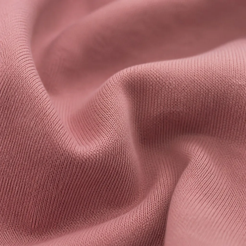
Start with what your hands can directly observe. Is the surface smooth, brushed, dry, cool or otherwise different from the intended collection direction? Does the fabric feel consistent across the centre, corners and edge? Note the observation in plain language instead of converting it into an unsupported performance claim. For example, say that the sample feels more structured than expected, rather than claiming a particular level of durability or breathability.
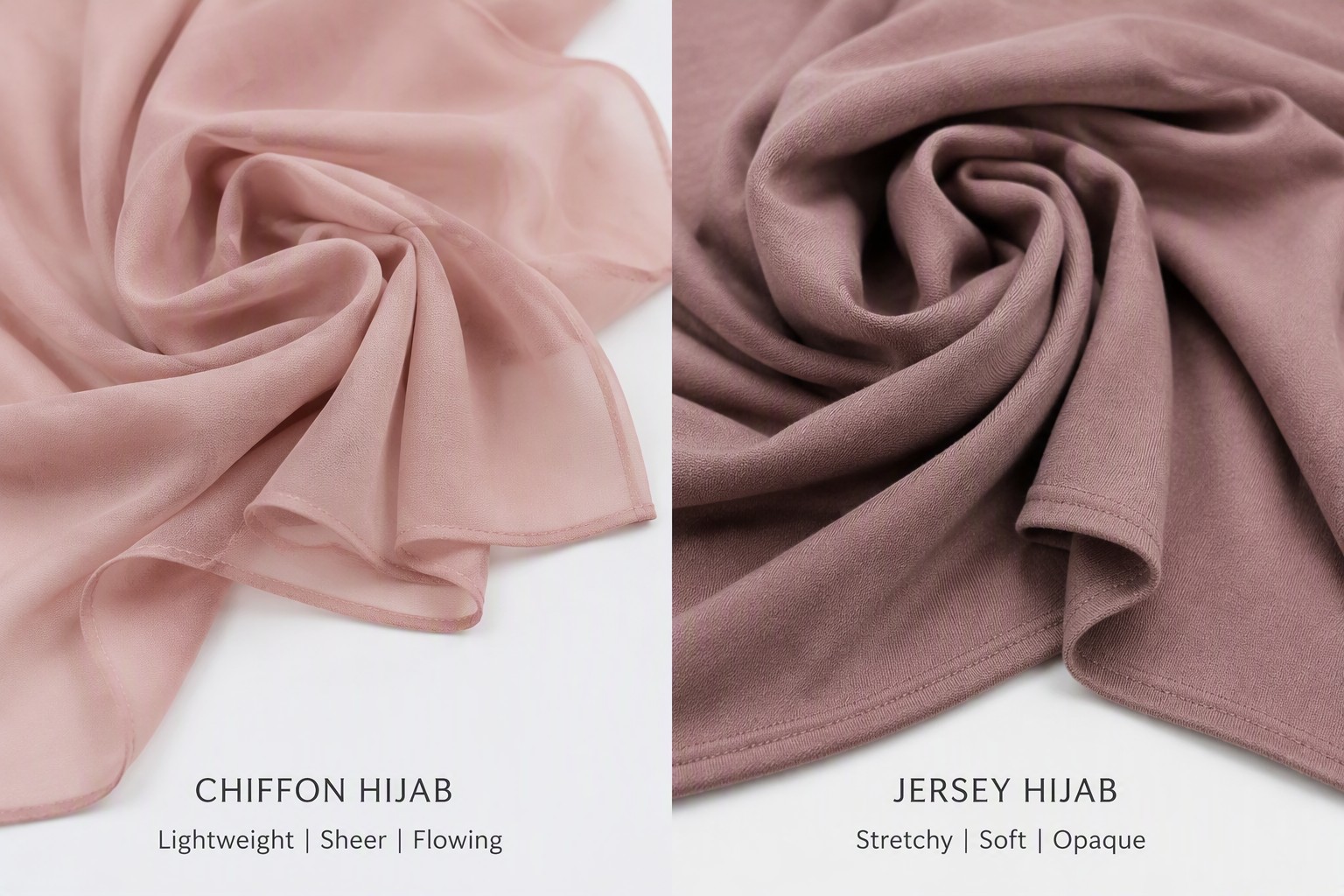
Keep fibre and structure terminology precise in the review. Modal describes a fibre direction, while jersey describes a weft-knit structure. They are not mutually exclusive. If the brief requested jersey modal, review the hand and appearance of that specific combination. If the sample is a printed modal direction, compare it with the intended modal reference rather than assuming that a different knit base will behave the same way.
Write down the comparison point that matters to the collection. A boutique occasion line may need a fluid visual impression, while an everyday line may need a different hand and styling response. The purpose is not to rank fabrics universally. It is to decide whether this sample supports the particular design brief.
Observe Drape in Three Simple Positions
Review the sample flat first, then folded and worn or loosely draped. Flat viewing shows the complete rectangle and makes it easier to see whether the artwork is balanced. Folding shows how motifs overlap and whether the border remains legible. A loose drape or simple face-framing try-on shows which parts of the design become visible in use.
Use the same positions for every sample in a comparison. Record whether the fabric falls as the brief intended, whether the focal motif disappears into a fold and whether the corners pull the design away from the face-framing area. These are design observations, not universal claims about the fabric. If the intended styling cannot be reproduced at home, photograph the closest consistent arrangement and explain the limitation.
Check the transition between the central field and any border. A design can look balanced when it is flat but feel crowded when the border is folded near the face. Note the exact position that causes the concern so the next revision can address scale or placement instead of changing the entire artwork.
Review Print Position Against the Worn View
Compare the physical sample with the artwork preview by identifying three zones: the main focal area, the areas expected to show near the face and the ends or corners that frame the finished look. Confirm that the direction is correct and that the main motif is not rotated, shifted or hidden in a way the brief did not intend.
For a placement print, ask whether the focal area remains visible when the hijab is folded in the planned direction. For an all-over repeat, check whether the tile feels intentional at the edge and corner. For a border, look at the distance between the design and the finished edge. Keep the feedback specific: identify the motif, its approximate location and the change you want, such as moving the focal area inward or reducing the border width.
Do not use a home sample to make a claim about print penetration, wash fastness or other test evidence. If a performance result is required for the product decision, request the appropriate supporting information separately. The design review should record what is visible and what still needs documentation.
Compare Colour With the Right Reference
Colour review should begin with the agreed reference, not with memory. Place the sample beside the physical swatch or named Pantone reference and record which areas look warmer, cooler, lighter, darker or less saturated. If the artwork contains several important colours, comment on each one separately rather than describing the whole sample as simply off.
Keep the viewing conditions consistent. Photograph the reference and sample together, avoid strong coloured surfaces and note whether the review was made in daylight or another agreed setting. A phone photograph is evidence of the comparison setup, not a replacement for seeing the fabric in person. Screen images vary, and fabric appearance changes with light and angle.
If two fabric bases use the same colour direction, review them as separate approvals. A colour that feels right on one base should not be treated as automatically approved on another. State whether the sample is approved for the specific base shown, held for adjustment or ready for another comparison.
Look at the Edge as Part of the Design
The edge frames the rectangle, so review it together with the artwork rather than as a separate afterthought. Yiling lists rolled edge, overlocked and other hemming options. Compare the proposed finish with the design language: does it create the intended boundary, does it compete with the border and does the print appear to continue naturally toward the edge?
Inspect each side while the sample is flat, then look at the corners after folding. Note any visual issue with a location and a photograph. If the collection includes more than one edge finish, compare the same design with each finish before deciding. Keep the review about appearance and styling; do not turn a home check into a production inspection report.
Check that logos, text and key motifs remain inside the safe area stated in the brief. Background colour can run to the edge, but a signature element placed too close to a turned or wrapped edge may not read as intended. If the safe area was not defined, record that as an open decision for the next revision.
Try the Sample in the Intended Content Format
A sample that works in hand may need a different review when it appears in the collection's photographs. Take one flat-lay image, one folded image and one simple worn or draped image. Keep the camera distance and background as consistent as possible. The goal is not to create campaign content. It is to see whether the motif, border and colour story remain legible in the formats the brand expects to use.
Review the photos beside the physical sample. Note if glare, folds or cropping hide an important part of the design. Do not edit the image in a way that changes the apparent colour or fabric surface before sending feedback. If you use exposure or white-balance adjustments for readability, keep the original image and label any edited version clearly.
Record the Decision in Three Parts
Use three headings in the review note: approved, changes requested and questions still open. Under approved, list the parts that should not change, such as the focal motif or the selected edge direction. Under changes requested, name one action per sentence and identify the relevant file or photograph. Under open questions, request information that the home review cannot establish, such as current fibre content, care instructions or supporting test documentation.
Choose one decision for the sample round: approved as shown, approved with the listed changes or held for a new sample. Avoid sending several separate messages that contradict one another. One consolidated note with a version number gives the development team a clear reference and makes the next review easier to compare.
Common Home Review Mistakes
The most common mistakes are reviewing from memory instead of the brief, judging colour from a single screen image, looking only at the sample flat, ignoring the corners and edge, giving feedback such as make it nicer without identifying the change, and mixing observations from two fabric bases. Another mistake is asking the sample to prove a composition or performance statement that requires supplier documentation or a recognised test method.
A second avoidable problem is changing too many variables at once. If the artwork position, colour direction, base fabric and edge finish all change in one revision, the next sample will not show which decision solved the original concern. Keep the revision focused and state which elements must remain unchanged.
A Five-Minute Final Checklist
Before sending your review, confirm that the sample is identified by style and version, the original brief and references are attached, hand and drape observations are written separately from approval decisions, print position has been checked flat and worn, colour comments name the actual reference, the edge and corners have been photographed, the same sample has been shown in the intended content views, open documentation questions are listed separately and one person has been named as the final approver.
If the sample gives you enough information to decide the design direction, send the consolidated review with the artwork and colour references through the Request a Quote flow below this article. If it does not, describe the missing evidence or unresolved design question before asking for the next sample. A clear hold is more useful than an approval based on an assumption.
Frequently Asked Questions
What should I check when reviewing a hijab sample at home?+
Check the fabric hand, drape in flat and worn positions, print placement, colour against the agreed reference, edge finish, corners and how the design appears in consistent photographs. Record observations separately from approval decisions.
How should I compare a modal sample with a jersey modal sample?+
Review each base as its own sample. Modal describes a fibre direction and jersey describes a weft-knit structure, so they are not mutually exclusive. Compare the hand, drape and visual response against the collection brief rather than assuming one base represents the other.
Can a phone photo prove the exact fabric colour?+
No. Use the photo to show the sample and reference together under stated lighting, but do not treat a screen image as the only colour target. Compare with the Pantone textile reference or physical swatch named in the brief.
What print placement details should I include in feedback?+
Name the focal motif, its approximate location, the intended top and bottom direction, the areas visible when worn and the change requested. For a border, also describe the distance to the edge and how it looks after folding.
What does a home sample review not prove?+
It does not replace supplier documentation for fibre content, care information, certifications or test results. Request those records separately when they are needed for a label, product page or business decision.
How should I send sample revision feedback?+
Send one consolidated note with the sample version, approved elements, requested changes and open questions. Choose whether the result is approved as shown, approved with listed changes or held for a new sample.
Need a quote for your next order?
Free samples available. MOQ from 100 pieces. Ships to 50+ countries.
Request a Quote